


Product at Rill: My own journey from data to dashboard
Why I am using Rill for real product work and a case study
I am currently working on product at Rill, a final-mile tool that turns raw datasets into interactive dashboards faster than ever. I recognize the pain our product is trying to solve from my former contributions as a product data scientist. Sometimes it can feel like it takes a village to create the right sharable dashboard.
Asking for permission and buy in for several data tools that need to be strung together creates long delays in delivering value to stakeholders. I have seen this path kill many great analytics projects before they get off the ground. The vision for Rill removes many typical constraints encountered on the path to help you share your work earlier without the run around.

Tasting champagne is product work
Good product work requires building a deep well of empathy for customers and community. I do this by exploring quantitative signals in application telemetry, talking to community members to understand ‘why’ they take action, and building in the trenches with real with design partners that have real problems - however I find that these signals are best understood and put into context when I am using the product myself for a personal goal.
Testing my product with real work, also known as drinking my own champagne (or the less glamorous “dogfooding”) clarifies feedback signals, identifies gaps in what is being reported, and helps me focus on the right product hypotheses. I try to infuse our development process with champagne tasting in creative ways whenever the opportunity arises. For example, I have always measured and socialized our internal KPIs with Rill and have seen how much it does to focus internal hearts-and-minds on the product experience when we do so.
Thinking through my data narrative
Today my work is focused on writing this blog post. I want to share the deeper details of what it takes to create a real, meaningful hosted dashboard with Rill. Ideally, the dashboard itself would be an interesting resource for this post. The most interesting data tends to be private and protected by businesses. For example, though it would be interesting I can’t show you my internal KPIs dashboard. It is surprisingly hard to make a good example that most people find interesting or see themselves in!
To identify the right story I think about my audience, their goals and their skills. Most of my readers are probably interested in product work, user journeys, and an example of how to be successful with Rill. This is a place where I am well positioned to tell a great narrative, and I decided to make a shared dashboard that reflects my product journey with Rill using two open source data tools I have deep work experience with - Rill and web-science.
Many of the learnings will extend to other use cases and the insights represent a realistic, granular data to dashboard journey with Rill. If you want to go straight to the output, take a look at my interactive dashboard that shows my journey, then dive into the details of how I did this below.
Measuring browser-based workflows
Once I established the narrative I want to tell with my dashboard, I was ready to design data collection to make sure the story could be told. In this case, the product journey can be represented largely through browser activity across web sites.
To accomplish this, I isolated a browser instance of Firefox Nightly for data collection and installed microfiche. Microfiche is an alpha web extension that builds upon CITP's web-science library to collect browser flows across all webpages locally. This altitude of analytics provided a great way to measure my product journey because the marketing website, Rill local application, Rill cloud application, and associated research websites are all browser-based experiences.
In short - what I am showing here is not representative of the analytics being collected by the Rill product, which are very limited and privacy preserving. Microfiche is broader (across all domains) and deeper (page contents and metadata) in a way few data collection tools provide. The downside is that I can’t see any interactions in the CLI, which is a major part of the Rill workflow.
Awareness and Install: Rill
I installed Rill using a simple install script in the CLI. I didn’t spend much time pretending I was getting to know Rill in docs before I installed and the data reflects that. My entire consideration period was less than 1 minute of page viewing with almost none of that time being active. I would expect that to be longer for people that opt-in organically, but not by much. As with all products, it is important to tell the story of Rill quickly and clearly in a handful of words with clear CTAs to get to the next step with confidence.
Local dashboard - Example
When I play with new products I tend to start with the examples. I don’t think I am alone here. An informal community poll tells me this is where ~50% of people like to get started. At the time of writing, Rill’s default example is an exploratory data to dashboard pipeline for Saturday Night Live’s cast, characters and episodes.
I created Rill’s default example, so I am not spending a ton of time exploring the different product surfaces - sources, modeling with profiles, and metrics. Instead, I spent most of my time in the dashboard looking for insights.
When I am using Rill, I love to use cmd+click to copy out key terms and search for that content on the web. I spent 3.6 minutes exploring examples with most of that time spent in google following up on what I noticed in the dashboard. I have been kicking around the idea of enabling clickable URLs in dashboard leaderboard values that I want to put into our product explorations backlog.
Local dashboard - My data
Examples are a nice place to build intuition about how a product works, but few people are interested in an out of context example and even the most relevant example won’t be very share-worthy. Next, I dive in to the real work of turning the pile of data I care about into a share-worthy data narrative for this post. Overall I spent 94 minutes tuning this example. Most of my attention was spent on modeling, then refining the insights on the dashboard and looking up resources to do so (microfiche’s docs and rill’s docs).
Sources
Microfiche exports data as lists of JSONs locally. Unfortunately Rill doesn’t take this data format as a source, however it was straightforward to transform the data to NDJSON before ingestion and I included this python script as a preprocessing step before ingestion.
import json
import sys

json_file = sys.argv[1]
json_data = open(json_file)
ndjson_data = '\n'.join([json.dumps(record) for record in json.load(json_data)])
with open(json_file.split('-')[0]+ '.ndjson', "w") as file:
    file.write(ndjson_data)
This was the fastest path given my background and it worked for me to run manually, but it always felt like a bottleneck when I was trying to update my data sources over time. Much like a business, data collection was live and ongoing. For this job I am literally tracking the act of making my dashboard and it was nice to have it refreshed regularly. Once the data was ingested, I was delighted to see the tables were tidy and that each contained different parts of the narrative. I only spent 6 minutes looking at source ingestion in the application, but I also spent time outside of the application that is not tracked here.
Modeling
Once the data was ingested, I started building intuition about how I might extract additional insights and flexibility in data exploration. Rill uses duckDB, a fast analytical database with some very nice syntactic sugar. As I am modeling I am repeatedly looking at duckDB’s documentation to understand the right syntax for my goals. I like to chain my models in Rill because it allows me to inspect the profiles at every step along the way and isolate how I am 1) unifying tables and 2) enriching my raw data with a business narrative. I spent 27 minutes in the modeling view with 12 of those minutes being active. This was where the bulk of my time was spent for this job.
Unifying Model
Microfiche collects data in three tables that need to be joined into one big table using pageId. Creating one big events table where lookups against smaller tables (pages, articles) are precomputed and readable prepares the data for people to explore quickly.
events - Events represent browser activity. Events contain both page views (passive or active pages) and attention events (active interactions with pages).
pages - Metadata around urls, titles, and descriptions.
articles - The contents of pages that could be interpreted by Readability. Rich information that is only available for a small subset of pages, usually blog posts.
SELECT
  epoch_ms(CAST(a.createdAt AS INT64)) AS event_datetime,
  b.title AS page_title,
  c.title article_title,
  a.pageId AS pageId,
  str_split(url, '/') AS url_split,
  * EXCLUDE(createdAt, title, pageId),
FROM events a
LEFT JOIN pages b
  ON a.pageId = b.pageId
LEFT JOIN articles c
  ON a.pageId = c.pageId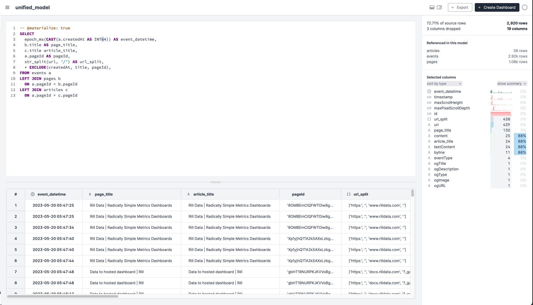
Enriched Model
I always enrich unified data with more metadata when I am preparing it for self-serve consumption. This is usually information that needs to be determined based on business narrative logic after-the-fact (journey milestones) or increase levels of categorical granularity (levels of site maps) to support self-serve exploration in the dashboard.
CASE statements help label the data with narrative logic.
STR_SPLIT help break up strings into substrings that create meaningful categorical drill downs for the interactive dashboard. For example, URLs contain rich information about site hierarchy and intent.
Window functions help label changes in user state over time or understand rolling aggregates. I often use this to capture the first time a behavior was seen.
SELECT
  *,

-- parsing strings to create explorable categories
  STR_SPLIT(url_split[3], '?')[1] AS domain,
  STR_SPLIT(url_split[4], '?')[1] AS page_1,
  STR_SPLIT(url_split[5], '?')[1] AS page_2,

-- case statement to categorize two major product surfaces from websites
  CASE
    WHEN STR_SPLIT(url_split[3], '?')[1] = 'localhost:9009'
         THEN 'rill local'
    WHEN STR_SPLIT(url_split[3], '?')[1] = 'ui.rilldata.com'
         THEN 'rill cloud'
    ELSE 'website' END AS browser_state,

-- window to find timestamp and apply to all rows for comparison
  MIN(
    CASE
      WHEN STR_SPLIT(url_split[3], '?')[1] = 'docs.rilldata.com'
         THEN event_datetime
      ELSE NULL END
    ) OVER(ORDER BY event_datetime) AS install,

...

FROM unified_model

User Journey Milestones - Key moments that represent getting to the next step on the user journey from data to dashboard. I like to make this a downstream model so I don’t need to manage unwieldy SQL.
SELECT
  *,
  CASE
    WHEN event_datetime > first_run_cloud THEN 'cloud dashboard - shareable'
    WHEN event_datetime > first_run_local_my_data THEN 'local dashboard - my data'
    WHEN event_datetime > first_run_local_example THEN 'local dashboard - example'
    WHEN event_datetime >= start THEN 'awareness and install'
    ELSE 'other' END AS milestones,
    DATE_DIFF('DAY', start, event_datetime) lifecycle_day_number
  FROM enriched_model
WHERE event_datetime < '2023-05-25'
Aggregates and Dashboard Config
After creating additional metadata for dimensions, I consider which aggregates will best tell the story. Here I want to tell a story around time and attention for each milestone and I create several aggregates to demonstrate these aspects of the journey. I spent 47 minutes viewing this surface, but only 6 of those minutes were active minutes. This likely reflects the amount of time I spent in an IDE editing the project files directly.
Seperate page views and attention view durations - Page view duration can be passive, but attention views must be active. They tell us different things about the user journey and can’t be combined. To do this in one dashboard, I wrote a case statement in the expression that only includes the correct event class.
Put scroll percent in context - Different websites and applications have different scroll depths. It is good to put the scroll depth in the context of each page’s height. The Rill application doesn’t have height “below the fold” because of the way it was built, however most websites like google do. I needed to CAST the column to a FLOAT in the expression to see the output as a percentage, but I hear this won’t be necessary once we upgrade to duckDB 0.8.
Reordering aggregates and dimensions - I want to sequence dimensions and aggregates in a way that helps me tell a narrative and I had to open an IDE to do this quickly. It is important to sequence aggregates and dimensions in a way that supports the narrative. Here the total number of events is less interesting than the duration that I was active. The milestones are more interesting as a high-level starting point than the URL.
Adding descriptions - Totally undervalued in most data work, adding descriptions that provide context are critical in understanding a self-serve endpoint.

Sharing my public dashboard
Rill deployments create hosted endpoints for project dashboards and are handled through CLI commands that open the browser. Running through deployment involved pushing my local changes to a Github repo, connecting Rill to my Github repo, moving my local data source to the cloud, and providing the right credentials to read my object store. Together, these features move my local analysis to a sharable cloud moment, but it felt a little bit heavy to get there.
Github
Everything I create in Rill is represented on the file system as project files. Rill feels a little bit different to me because most of the work is through a UI, not an IDE, and there are no reactive bi-directional updates if you work from the project file perspective. That being said, it was easy to use git to shared my project files with Rill using a Github repository. This BI-as-code framework leverages software engineering practices to enhance my deployment workflow in two ways:
Continuous integration - Once connected, Rill listens to my Github repository for changes to the project files and automatically redeploys any updates.
Ephemeral - Anyone with shared data access and these project files can clone the entire way from data store to interactive dashboard. I made this data private so only my trusted collaborators can rebuild the insights from the ground up.
GCS Storage and Credentials
I collected data for this post locally and ingested it locally. However, if I want to share my work with more people that don’t have access to my local computer, I need to upload data to an object store like S3 or GCS.
Read only storage credentials - I created and shared read-only GCS access with Rill to power my dashboard. This means that Rill has access to the granular data sources that power my dashboard, but it only surfaces the dashboard to viewers.
Public Rill project - Rill projects are private by default and require the admin to grant access to each user. In this case, the dashboard is not protected and I want anyone to be able to view it. It was easy to change access to public with the CLI.
Take aways
Rill unlocks fast ways to create and share dashboards that people will actually use. By drinking my champagne I was able to deepen my empathy for our users while delivering a nice demonstration of my journey for this post. Here are a few hypotheses around ways I might improve the product experience that I want to bring back to my team and community:
Modeling with DuckDB - I repeatedly look at the duckDB documentation while I am modeling. I found that going back and forth between duckDB’s docs and our application adds some friction to quickly getting to the right function. I have a hypothesis that the data modeler would be a sticker experience if we better supported writing complex SQL and surfacing their delightful syntax.
Metrics configs to data narratives - It should be easier to add complex expressions and reorder measures and dimensions in the editor. Though customers don’t spend much time on this surface, the friction caused by the experience makes it challenging to deliver a good data narrative as you open and close the application to move between project files and the application’s UI. I have a hypothesis that more people would get to a meaningful dashboard they share with someone if we made this moment more frictionless.
Scrub to zoom - Rill excels at creating dashboards that measure near-term real-time data across many users. The sparseness of my own single-user data and the SNL example reflects activity across sessions and days that can be hard to explore. I want to be able to scrub to zoom in on artifacts in the data. I have a hypothesis that including scrub to zoom features on the dashboard would increase its utility and drive people to share and reuse their dashboard.
Moving local sources to cloud - The leap from local to cloud was largely undocumented and excludes those that don’t have an S3 or GCS account. I have a hypothesis that this will be a blocker for users that have limited platform access.
Have you used Rill and you have your own hypotheses about what would make it better? Let me know in the comments.